Thrix has a new look!
Published: 15 April 2026
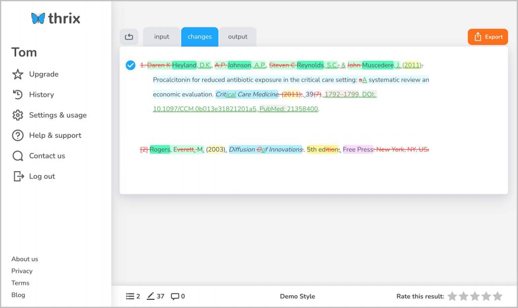
We’ve made some changes to the Thrix interface to make it cleaner and more intuitive when you’re reviewing edited references.
Previously, your references sat in the centre of the page, with navigation across the top and a footer at the bottom. This worked, but it wasn’t always the most efficient use of space – particularly on mobile devices.
What’s changed?
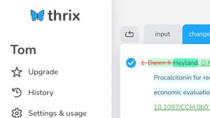
We’ve introduced a left-hand panel, that replaces the navigation bar and the footer. From here, you can quickly access things like:
- History
- Settings & usage
- Contact us
- Blog
Why we made this change
This shift makes navigation more consistent and keeps the main workspace focused on what matters: your references.
By moving navigation to the side, we’ve:
- Improved discoverability of features like history and settings
- Reduced clutter around your working area
- Freed up vertical space, so you can see more of your references at once
- Improved usability on mobile devices, where screen space is limited
Whether you’re a professional editor, a researcher, or a student, this layout should help you work more efficiently. It also gives us a space to add new, discoverable features in the future.
We’d love your feedback
We’re always working hard to improve Thrix, with lots more to come. Your feedback genuinely shapes what we build next.
If you have any feedback, or if you encounter any problems, let us know in the comments below, or contact us.
As always, thanks for using Thrix.
The new layout definitely feels more streamlined, especially on mobile—great to see the navigation shifted to the side so the focus stays on the references. It’s a small change that makes a big difference in usability.